

Worst Color Combos in Fashion (And Smarter Ways to Style Them)
Color is emotional. It’s instinctive. It’s also ruthless. One wrong pairing can quietly sabotage an otherwise great outfit. The worst color combos don’t always scream for attention. Sometimes, they just feel… off. Heavy. Awkward. Unfinished.
The good news? Most “bad” color combinations aren’t hopeless. They just need smarter styling, better balance, or a little breathing room.
Let’s break down the most common offenders and how fashion insiders rescue them.
1. Red and Green Outside the Right Context


This combo struggles because it instantly triggers seasonal associations. Without intention, it feels costume-like.
Both colors are bold, high-contrast, and emotionally loud.
How to fix it:
- Choose muted versions like burgundy and olive
- Separate the colors with neutrals
- Use one as an accent, not a full look
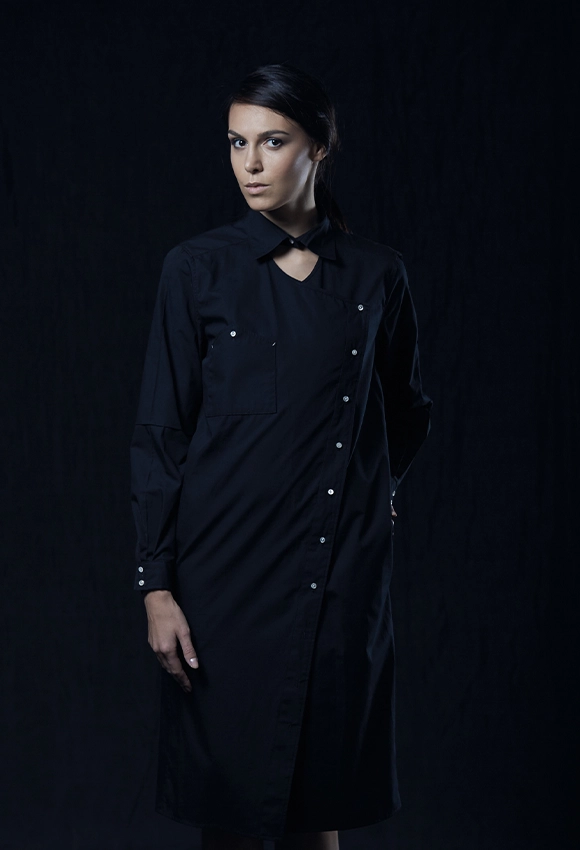
2. Brown and Black Without Contrast

Brown and black can look chic or completely flat. When tones are too similar in depth, the outfit lacks dimension.
How to fix it:
- Mix textures like leather, wool, or suede
- Keep one color clearly lighter or darker
- Add a crisp neutral like cream or white
3. Neon Paired With Pastels

This is one of the fastest ways to confuse the eye. Neons demand attention. Pastels whisper. Together, they fight.
How to fix it:
- Anchor neon with black, grey, or denim
- Keep pastels in accessories only
- Avoid equal visual weight
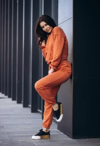
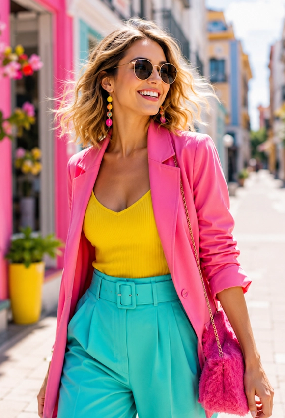
4. Orange and Pink Without Intentional Styling

This pairing can look editorial or chaotic. Warm tones compete unless carefully balanced.
How to fix it:
- Stick to dusty or muted versions
- Use one shade as a small accent
- Break it up with beige or tan
5. Grey and Beige That Feel Washed Out

Neutral doesn’t always mean polished. Low contrast makes the outfit look unfinished.
How to fix it:
- Add sharp tailoring
- Introduce texture or metallic accents
- Choose warmer greys or richer beiges
6. Purple and Yellow in Everyday Outfits

Bold color theory doesn’t always translate to wearability. Both colors sit opposite on the wheel and demand dominance.
How to fix it:
- Use one color sparingly
- Choose softer tones like lavender or butter yellow
- Keep silhouettes clean and minimal
7. Navy and Black Without Separation

This combo often looks like a mistake rather than a choice. Without contrast, it reads accidental.
How to fix it:
- Add white or metallic accessories
- Mix fabrics for visual depth
- Clearly define layers
Why Some Color Combos Feel “Wrong”
The worst color combos usually fail for one of three reasons:
- Equal intensity with no hierarchy
- No contrast or too much contrast
- Conflicting undertones
Fashion works best when the eye knows where to land.
How Stylists Avoid Bad Color Pairings
Professional stylists rely on a few quiet rules:
- One dominant color per outfit
- Neutrals as visual pauses
- Texture over extra color
- Intentional imbalance
When color feels deliberate, it almost always works.
FAQs
What are the worst color combos in fashion?
Common offenders include red and green, neon with pastels, brown and black without contrast, and washed-out neutral pairings.
Can bad color combos be fixed?
Yes. Most combinations improve with better proportions, texture, or added neutrals.
Are there truly “bad” color combinations?
Not exactly. Most color combos fail due to poor balance, not the colors themselves.
How do I know if colors clash?
If your eye feels restless or the outfit lacks focus, the colors may be competing.
Do trends affect color pairing rules?
Absolutely. Fashion cycles redefine what feels modern or dated.
Can accessories fix a bad color combo?
Yes. Shoes, bags, or belts in neutral tones can reset the look.
The worst color combos aren’t fashion crimes. They’re styling puzzles. With intention, contrast, and confidence, even the most questionable pairing can turn into a statement.


